

Picasa is Google's free photo editing software. It rocks. In comparison to the power of Photoshop, it does very little. However, for beginners and those in a time crunch, Picasa works wonders and is super easy to use. Oh, and did I mention it's free? You can download it here.
To demonstrate the awesomeness, I'm going to walk through a basic edit that I did today. When I open up Picasa, it automatically sorts my pictures and shows them to me like this. I choose the picture I want and double click on it.

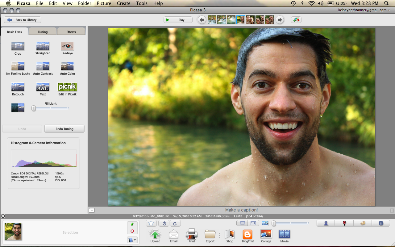
Up pops an editing window! On the left side, I am shown a list of options that fall under 3 folders, Basic Fixes, Tuning and Effects.
Basic Fixes is super quick, but also pretty limited. You can tell the program to automatically correct the contrast or the color in your picture. Or, if you're "Feeling Lucky," it will correct both in one click. I'm going to skip this tab because:
#1. I like the crop already
#2. I want to do all the fine tuning on my own

So I click on the Tuning tab and see a window like this:
The Tuning tab allows me to play with individual aspects of my contrast and color. First, I start with fill light. Increasing this brings more light to the entire picture.

Next is highlights. Normally, I like to play with highlights a lot. I like to create contrast and make things pop. However, in this picture, increasing the highlights creates hot spots that I don't want both in Grant's hair and in the bushes behind him. So I leave it untouched.

Next, I bump up the shadows. Mixing shadows with either highlights, fill light, or a combination of both creates contrast. Me likey.

The last thing under tuning that I like to mess with is the Color Temperature. Basically, moving the tab left makes your picture more blue, and moving it right makes your picture more red. Unless the picture is already too red, I like to move the tab a little right. It adds a little color to everyone's faces.
Be careful though. Too far=Oompa Loompa.

For this picture I had one last thing in mind. I moved over to the effects tab, which looks like this: Some of my favorite effects here include saturation (when editing pictures without people in them), warmify (when creating a more vintage look), and sharpen (which, sharpens your pictures... imagine that).

For this picture, I click on sharpen and move the bar over as far as it will go. In cases where your picture is just a little too blurry, this will take some of the fuzziness away. It also creates a nice contrast between foreground and background, although it is quite subtle.

It is not a huge difference, but I think the bottom image is just a little crisper.


Whabam! Done! Now I have to export the picture. Picasa doesn't change the original file so you have to create another file to use the edited picture outside Picasa.
I click the Export folder at the bottom of the screen, choose the folder I want, and press Export!

Different? Better? What do you think?

Picasa is a keeper. A free keeper.
As a side note, Picasa just bought another editing website called Piknik. Piknik is a great little site and their free version is even a bit more advanced than Picasa. However, I prefer Picasa because it is a separate program that I download to my computer and don't need internet access to use. Amen.

0 comments:
Post a Comment
Whatchya thinking?